Long-ish pages
One of the most stark differences between regular GUI documentation and developer documentation is that developer doc pages tend to be longer. In a post on designing great API docs, the writers at Parse explain
Minimize Clicking
It's no secret that developers hate to click. Don't spread your documentation onto a million different pages. Keep related topics close to each other on the same page.
We're big fans of long single page guides that let users see the big picture with the ability to easily zoom into the details with a persistent navigation bar. This has the great side effect that users can search all the content with an in-page browser search.
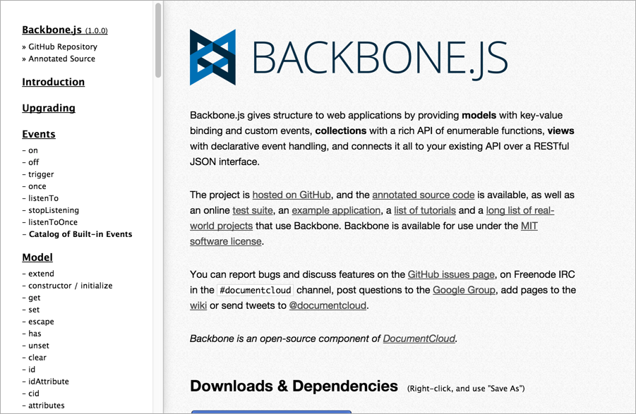
A great example of this is the Backbone.js documentation, which has everything at your fingertips.
Examples of long pages
Here's the Backbone.js documentation:
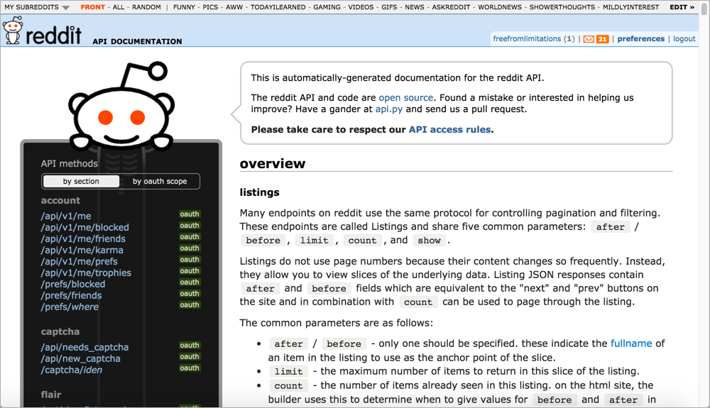
For another example of a long page, see the Reddit API:
Why long pages?
Why do API doc sites tend to have long-ish pages? Here are a few reasons:
- Provides the big picture: As the Parse writers indicate, single-page docs allow users to zoom out or in depending on the information they need. A new developer might zoom out to get the big picture, learning the base REST path and how to submit calls. But a more advanced developer already familiar with the API might only need to check the parameters allowed for a specific endpoint. The single-page doc model allows developers to jump to the right page and use Ctrl+F to locate the information.
- Many platforms lack search: A lot of the API doc sites don't have good search engines. In fact, many lack search altogether. This is partly because Google does such a better job at search, the in-site search feature of any website is going to be meager by comparison. Also, some of the other document generator and static site generator tools just don't have search (neither did Javadoc). Without search, you can find information by creating long pages and using Ctrl+F.
- Everything is at your fingertips: If the information is chunked up into little pieces here and there, requiring users to click around constantly to find anything, the experience can be like playing information pinball. As a general strategy, you want to include complete information on a page. If an API resource has several different methods, splitting them out into separate pages can create findability issues. Sometimes it makes sense to keep all related information in one place, or rather "everything at your fingertips."
- Today's navigation controls are sophisticated: Today there are better navigation controls for moving around on long pages than in the past. For example, Bootstrap's Scrollspy feature dynamically highlights your place in the sidebar as you're scrolling down the page. Other solutions allow collapsing or expanding of sections to show content only if users need it.
Is it a best practice to make long pages?
Usually the long pages on a site are the reference pages. Personally, I'm not a fan of listing every endpoint on the same page. Either way you approach it, developers probably won't care that much. They will care much more about the content on the page rather than the page length.